If Your Next Kitchen Is A Shaker Kitchen, Avoid These Common Design Mistakes
The Shaker kitchen offers an understated style that emphasizes refined elegance through simplicity, high-quality craftsmanship, and muted, neutral color palettes. While the traditional style gives a sense of history, it’s plain enough to allow you to add your own personal touch.
Its founders, the Shakers, that is, New England’s forgotten society, believed that everything in the home should have a clear, intentional purpose and that ornate decorations are unnecessary. The focus was on usefulness and long-lasting quality instead. If that’s your goal, you don’t need to search anymore; this design suits you perfectly.
Naturally, you’ll always have a few small regrets, but if you ignore the basic guidelines of Shaker kitchen design, the mistakes will be much larger and far costlier to correct. Getting it right is about honoring that conceptual, timeless balance of utility, simplicity, and craftsmanship.
A kitchen should be the central hub of your house, but some design errors can fast turn it into something unwelcoming. If you’re looking to update your kitchen with a Shaker look, these are the errors that often lead to regret.
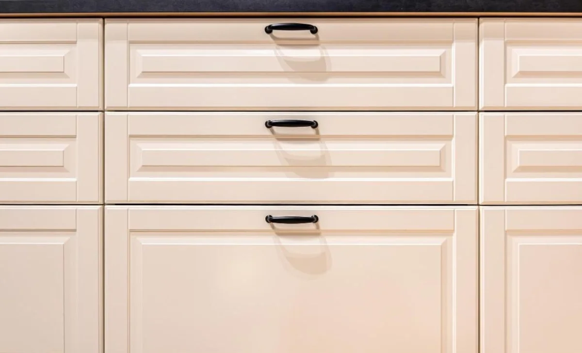
Settling For The Wrong Rail And Stile Width
Long before the Bauhaus or modern Scandinavian design, the Shakers stripped away anything that could clutter thoughts and spaces. If a feature didn’t serve a practical purpose, it was considered futile. For example, cornices with deep reliefs were seen as prideful distractions, so Shakers preferred to make joints so impeccably that they didn’t need to be hidden.
Besides ornate moldings, do your best to avoid bevels and raised panels because they will create a chaotic and unkempt space. Ultimately, less is more. They say rules are meant to be broken, but we’re not convinced this one needs to be.
A Shaker-style door features a recessed flat center panel framed by rectangular borders. This frame consists of two vertical members, referred to as stiles, and two horizontal members, otherwise known as rails, that meet at right angles to create its signature clean lines.
When planning a layout, it’s important to take note that the width of the Shaker door is 2.25 to 2.75 inches. Anything wider looks chunky, whereas anything narrower appears flimsy or overly modern. If you want to add a contemporary touch to your home for the year ahead, go with a thinner frame. It’s subtle, but still gives you the “look.”
Too Much Material Mixing
Choosing kitchen wall units for a Shaker aesthetic boosts functionality while preserving its understated elegance that stands the test of time. Designed to complement the sleek lines and simplicity of Shaker cabinetry, these units supply invaluable vertical storage without compromising the kitchen’s minimalist character.
A main thing that makes Shaker kitchens stand out is the thoughtful selection of what they’re made from. The kitchen units are usually made from solid wood (oak, maple, ash, cherry, pine), MDF, and plywood (birch or maple). Modern designs often mix MDF doors with plywood boxes and stone or quartz countertops for stability and longevity.
It goes without saying that you should avoid mixing too many materials because it can backfire and make the kitchen look over-the-top, which goes against the Shaker philosophy. A Shaker kitchen should make your life easier, not the other way around. If you introduce clashing wood grains, the eye doesn’t know where to rest.
Mixing materials, especially experimental or trendy ones, immediately makes your kitchen look dated and can impact your home’s future real estate value. People love Shaker kitchens because they’re simple, functional, and above all, timeless.
Focusing Exclusively On Appearance While Ignoring Proportions
Nailing down the Shaker look can be done, but it won’t be easy. The plainness of the design makes any mistake stand out, and the cleaner the lines, the less room you have to hide imperfections. Every joint, every proportion, every surface has to be weighed, because even small flaws become immediately noticeable.
One of the most common mistakes people make is forcing a frame onto a 4-inch drawer. At that size, the rails and stiles start to look cramped, and the drawer loses the clean, balanced geometry that characterizes Shaker genius. Instead of reading as simple and elegant, it comes off as fussy.
Place flat, unadorned slab drawers at eye level to simplify the visual workspace and use Shaker fronts for the deeper bottom drawers to add necessary texture and architectural weight. This intentional contrast is a signature move in high-end custom cabinetry, as it breaks up the monotony of a single door style and underlines a bespoke, furniture-grade design rather than a standard off-the-shelf set.
The result is a kitchen that balances modern minimalism with classic craft in a way that feels fresh and enduring. It’s the type of space that doesn’t demand notice but impresses people who examine it more closely.
Poor Lighting Choices
Nothing breaks your heart like investing time and effort into making the kitchen feel homely and welcoming, only to have the vibe killed by inappropriate lighting. The Shaker style counts on depth, shadow, and texture, so without the right light, those beautiful recessed panels just look dull, lifeless, you name it.
Many homeowners overcompensate for Shaker simplicity by installing a grid of generic recessed canned lights that creates harsh shadows inside the cabinet frames and makes the room feel sterile. Don’t follow in their footsteps. Use layered lighting. More often than not, people choose pendants that are either too dinky or so industrial that they overwhelm the cabinetry.
Opt for lantern styles, dome pendants, or milk glass, which anchor the space without overpowering it. Look for simple, well‑proportioned fixtures in warm metals, glass, or soft matte finishes that complement the cabinetry rather than compete with it.
Placement and height are equally important. Hanging the pendants too high makes them feel disconnected from the room, like they’re floating away, while hanging them too low creates a visual barrier that cuts the kitchen in half.