Choosing the Right Color Palettes to Influence Mood in Every Room
Color is not just a visual option; it is a psychological instrument that is used to create perceptions, emotions, and actions in the place of living. Choosing colors in a contemporary rental setting can transform the interiors into soothing, exciting, or welcoming spaces, depending on the desired atmosphere. From softly neutral colors that make one feel open to brash ones that inspire creativity, color is a defining feature of a space’s experience.
According to experts in property management in San Diego, well-considered color schemes, i.e., warm neutrals combined with soft accent coloration, can be more visually appealing and provide a pleasant impression, resulting in a higher rental value of the property.
Color strategy has become a fundamental design factor in competitive housing markets and leads to tenant satisfaction and quality perception.
Five Ways to Apply Color Psychology to Influence Mood and Improve Interiors
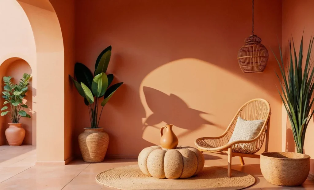
1. Warm Tones to bring about Coziness and Vitality
Experts engaged in property management in San Antonio suggest using warm colors like soft terracotta, dull yellows, and warm beige to enhance warm living conditions—this augments the total rental value of the property since the interiors are made to be warm and welcoming.
The warm colors are considered to stimulate a sense of comfort, warmth, and friendliness. These tones are especially beneficial in living rooms and dining areas, where people can feel free to interact and relax. Warm colors used sparingly will provide a warm feeling without bombarding the room.
Walls can be accented or have decorative features in warm colors without being imbalanced. These tones blended with neutral bases are to make sure that the design is sophisticated and flexible.
Did you know?
The average price of the rental market in San Antonio is approximately $2,000 a month.
2. Use Cool Colors to Relax and Calm Down
Soft blues, greens, and dull grays are cool colors, which are linked to calmness and restfulness. These colors are also effective, especially in bedrooms and bathrooms, where one needs to have a relaxing atmosphere.
Light blue colors may provide a sense of transparency and peacefulness, whereas green colors allow interiors to relate to nature and create a healthy, invigorating effect. The colors are used to minimize visual stress and provide a calming atmosphere.
They are also made calmer by the introduction of cool colors and natural textures, like wood or linen. This mix creates a harmonious interior that is both contemporary and easy to live in.
3. Add Neutrals to Neutralize and be balanced
Most modern interiors are based on neutral color schemes. The use of colors like white, beige, gray, and taupe offers a neutral palette that lets other design elements shine.
Neutrals would create an impression of openness and cleanliness, resulting in a more cohesive, larger space. This comes in handy, especially in rental properties where flexibility is a key factor in attracting so many tenants.
Interiors have a harmonious appearance by contrasting neutral walls with subtle accent colors, which will never be outdated. The design is such that spaces are flexible and can be customized.
Did you know?
The San Diego rental market is quite competitive, with an average rent of over $2,200 per month.
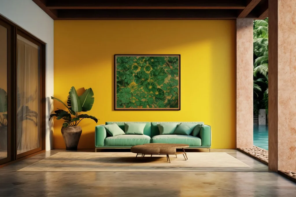
4. Add Personality and Focus With Accent Colors
The colors on the accents add character and visual appeal, but do not predominate the design. Deep navy, emerald green, or burnt orange is a bold color that can be strategically used to highlight specific areas in a room.
Such accents highlight points of interest like furniture, artwork, or architecture. They produce contrast and depth when used in a considered manner, and ensure overall harmony.
The accent colors can also be updated easily. Replacing cushions, artwork, or decorative items would be sufficient to renovate the room without redesigning it.
5. Take lighting and space into Account in choosing Colors
Light is crucial in the perception of colors. Natural light increases brightness and shows the actual colors, whereas artificial light may alter hues.
Poorly lit rooms are better suited to lighter colors, which reflect light and make the rooms appear open. On the other hand, bright rooms can accommodate darker colors without feeling like a cage.
Color choice is also dependent on the size of the room. Light colors can help make small spaces look bigger, whereas darker colors may help provide intimacy in larger spaces. Knowledge of these dynamics ensures that the color options enhance mood and the perception of space.
End Point
The art of color proves that it’s an effective instrument to create the space’s experience. Warm colors can make the space cozy, cool colors can make it relaxing, neutral colors can make it balanced, and accents can make it feel more personal.
Careful consideration of lighting can turn the interiors into spaces that can help them be functional and make them feel better. The strategic color selection in the competitive rental markets adds to appeal and perceived value and establishes a timeless and inviting living space.